Case Study
The Missed Showtime
This project started when my instructor accidentally purchased a movie ticket for a showtime only ten minutes later—and he was nowhere near the cinema. The ticket was non-refundable, the system didn’t warn him clearly, and what looked like a small mistake turned into a frustrating experience. I became curious: how often does this happen, why does it happen, and is the real problem the interface, the timing, or the lack of guidance? So I turned it into a small UX research exercise to understand what actually goes wrong in these rushed, everyday moments.
User Truths That I Found Out
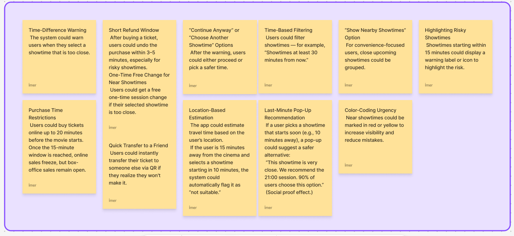
As I explored the flow, it became clear that the issue wasn’t just one wrong tap. It was a mix of unclear time cues, fast-checkout behavior, and the pressure people feel when making quick decisions online. Many users rely on habit and visual shortcuts—so when the system doesn’t highlight critical information (like “this show starts in 10 minutes”), mistakes become surprisingly easy. I mapped out these moments, looked at where misunderstandings happen, and used quick brainstorming sessions to explore how the experience could feel more supportive and less error-prone.
What I Believed at First/ The Real Problem
At first, it seemed like a simple mistake — just choosing the wrong showtime. But the more I explored it, the clearer it became that the issue was deeper. When users make quick decisions and the interface doesn’t guide them clearly enough, small errors can easily slip through. The real problem wasn’t the ticket itself, but how the time-selection flow made it too easy to miss a critical detail.
What It Turned Into
When the app is first installed, users are asked to prioritize notifications. They select which apps are most important to them. Based on this priority, critical notifications appear at the top of the lock screen and home screen, while less important ones are grouped quietly in the background. This approach reduces notification clutter while ensuring users don’t miss what truly matters.
