Case Study
Too Much to See Clearly
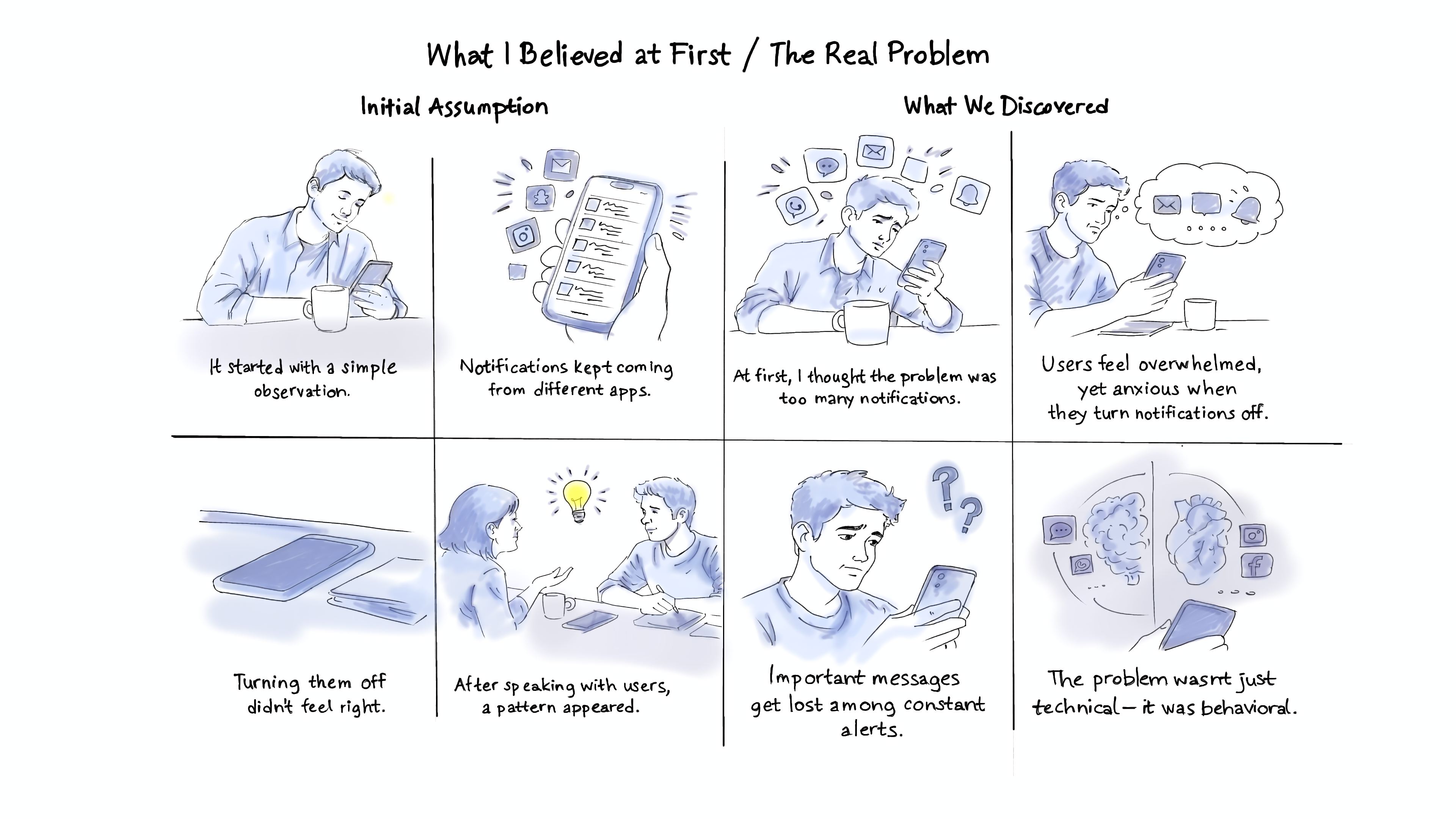
This project started during a workshop, where our group chose a topic — phones are flooded with notifications, making it hard to tell what actually matters. At first, we didn’t know if this was the real issue or just the surface of something deeper, so we dug in. Even I often miss important messages buried under social or promotional alerts. That curiosity and confusion around the “real problem” is what kicked everything off.
Design Process
1
2
3
4
Discover:
Define:
Develop:
Deliver:
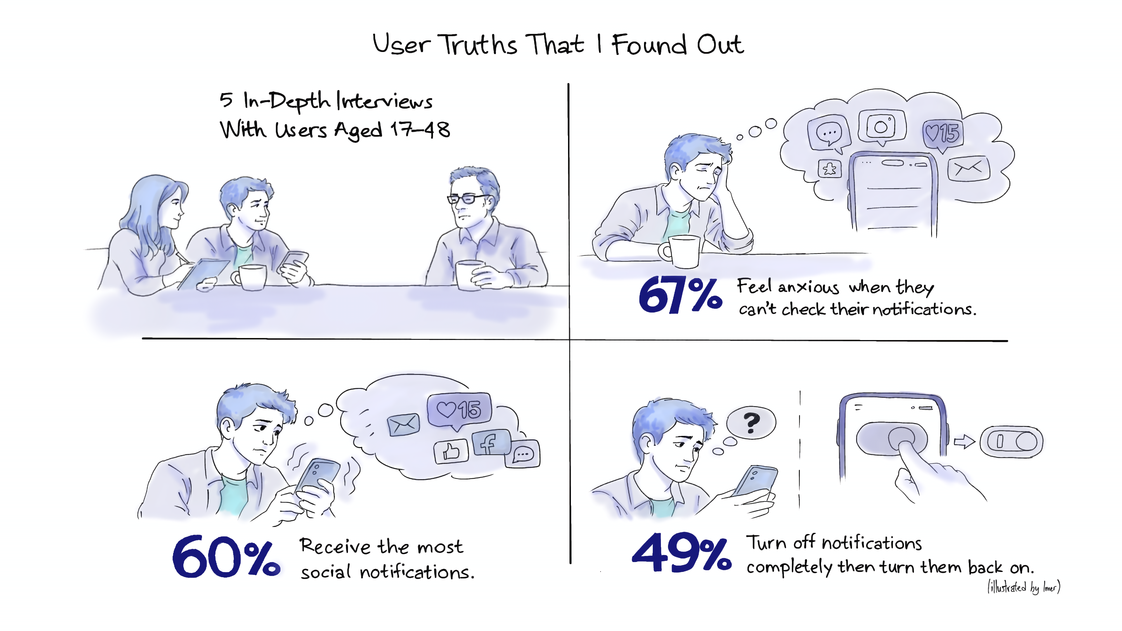
Interviews with 5 users, survey, observation → pain & gain points
Brainstorming, ideation, sketching
Themed insights → problem statement
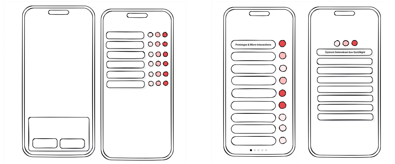
Wireframes and prototype testing
User Truths That I Found Out
What I Believed at First/ The Real Problem

Moments That Changed the Design
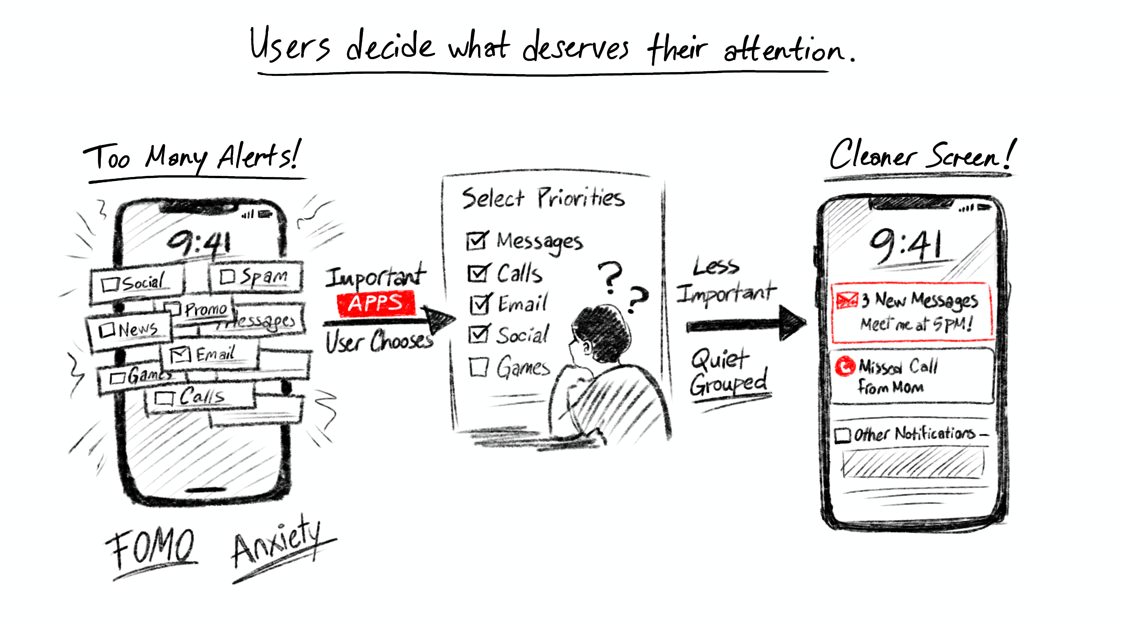
We didn’t face major issues during brainstorming or wireframing, but user conversations revealed the main challenges: FOMO, anxiety when disabling notifications, and missing important messages. Users also wanted control and guidance over notifications, which became the focus of our design.

What It Turned Into

After the brainstorming phase, the final solution works as follows:
Step 1: When the app is first launched, users prioritize their notifications.Step 2: They select which apps matter most to them.Step 3: Critical notifications appear at the top of the lock screen and home screen.Step 4: Less important notifications are quietly grouped in the background.
Result: Notification clutter is reduced, while important messages are never missed.